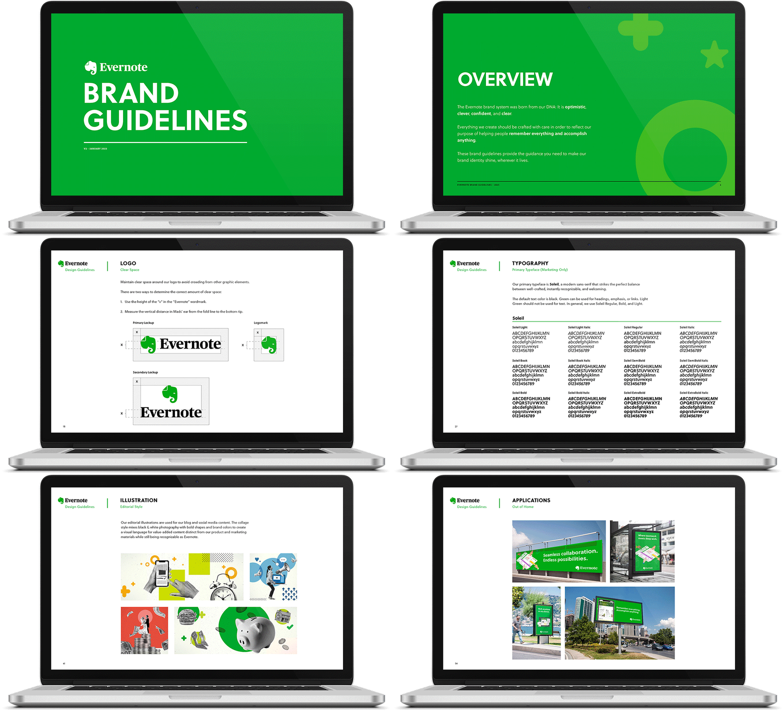
Refreshed Brand Guidelines
The document included sections for Brand Strategy, Voice & Tone, Logo Usage, Color, Typography, Shapes & Patterns, Illustration, Motion, Photo Direction, Type as Art, and Application Examples.

Illustrations
The brand evolved from the exclusive use of flat illustrations and began to incorporate 3D and perspective when appropriate.
Icon Library
I led the team in modernizing and organizing our icon library. We introduced an updated color palette, color families, and more consistent execution across dozens of marketing icons.

Editorial Design Style
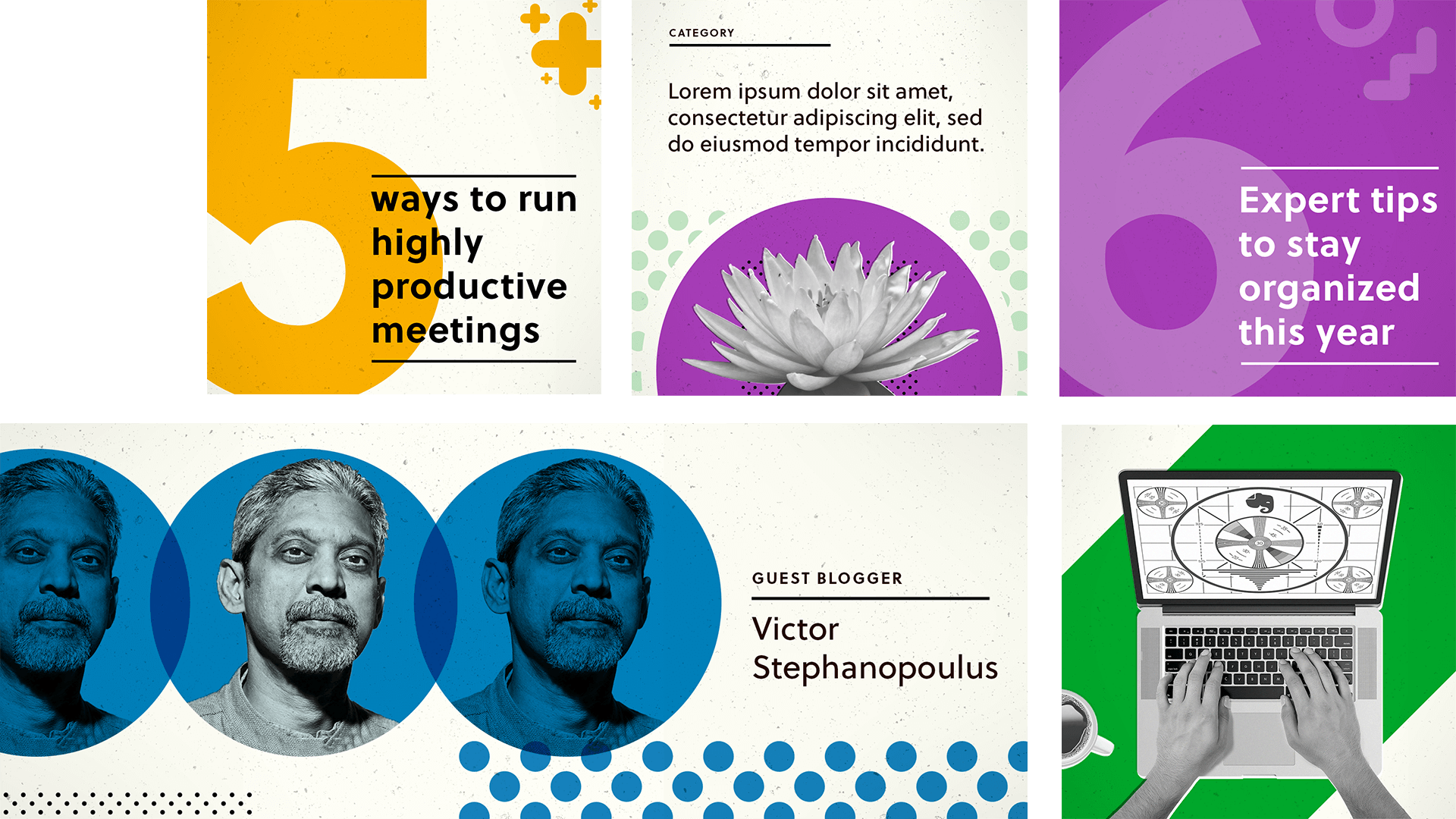
The editorial team at Evernote wanted to drastically expand their editorial calendar but were constrained by creative resources. To solve this I developed a new style for our editorial content. The new collage style was distinct enough from our marketing so readers could immediately differentiate our ‘value-add’ content from our product messaging, but by using familiar patterns and colors it was still brand-right and ownable.
Efficiency Gains
The style incorporated stock photography to speed up production but edited the photos in a way that made them our own. This approach was expected to increase production by 3X but when put in to practice creative production was closer to 5X without adding headcount.


